Blog

Details

  • Colour of the Week – Star-Studded

    by Jesse Dang | Aug 07, 2024

    Create a Dramatic Look with Star-Studded Elegance 

    If you want to make a bold yet sophisticated statement in your home, consider pairing a deep, dramatic colour like Cloverdale Paint’s Star-Studded (0620, ColourIs Collection) with a contrasting white or off-white trim and décor. This rich, velvety colour from our Lavender/Purple palette provides an intense backdrop that will elevate any room. 

    How to Achieve This Look

    Paint your walls a deep, luxurious shade like Star-Studded and pair it with a crisp white or off-white trim to create a sharp, clean contrast that makes the colour pop. Incorporate neutral and white furnishings and décor, like a white sofa, duvet, lamp or artwork to balance the intensity of the walls/trim and keep the space feeling light, bright and airy. Add dark blue/purple accent pieces like pillows, throws or vases to tie it all together. 

    Where it Works

    This look is perfect for spaces where you want to create a feeling of drama or sophistication. Try Star-Studded in living rooms, bedrooms or home offices. This colour can add depth to larger rooms, making them feel more inviting and cozier.

    Where to Avoid 

    Avoid using this colour scheme in small, poorly lit rooms. The darker colour can make the space feel even smaller and cramped. Also, if your home has uneven walls or imperfect trim, the high contrast between dark walls and light trim can accentuate the flaws and look messy and unpolished.

    By carefully selecting the right space and ensuring you’ve got clean lines to work with, you can transform your home with the elegance of Star-Studded. Shoot for the stars! Visit your local Cloverdale Paint store to get started today!


    Youtube video https://www.youtube.com/watch?v=Go8vRNX9xeg

  • Transformative Textures

    by Jesse Dang | Aug 07, 2024

    Combine Paints and Fabrics for a Layered Look in Any Room

    Transform your living spaces by incorporating patterns and textures to add depth, visual interest and a personal touch to any room in your home. Here are some tips to combine paints and fabrics to achieve a layered look: 

    1. Select a cohesive colour palette

    To avoid clashing and visual overwhelm, follow the 60-30-10 rule. Allocate 60% of your palette to your primary colour, used on anything large or central to the room, for example, sofas, rugs, and main walls. Use 30% for secondary colours, used on soft furnishings like curtains, bed linens, and accent pieces. Reserve 10% for smaller elements like cushions and lamps to balance the colours. 

    2. Mix and match textures

    Combine different textures to add interest to your space. For example, pair matte wall paint with a glossy trim for an elegant contrast. Or, using fabrics, mix smooth materials like silks with textured ones like velvet. Avoid using uniform textures and finishes throughout. 

    3. Add a feature wall and accent pieces

    Create a focal point for your room with a feature wall. Choose a bold, dynamic colour that complements your main wall colour and pair it with neutral fabrics for balance. Or, use textured paint finishes like sandstone to create a subtle, gritty texture resembling natural sandstone. 

    4. Introduce harmonious contrasts

    Balance bold and subtle, intricate and simple, and vibrant and muted elements. Too much of a good thing can overwhelm a room, while too much subtlety can make it look dull and sterile. 

    5. Add natural elements

    Introduce natural textures like wood, stone, or woven pieces. Enhance visual interest with plants, flowers and candlelight. 

    Playing with textures and patterns using paint, accessories, rugs, curtains and cushions can elevate the appearance of any room. Start your transformation with finishes from Cloverdale Paint. Join the Cloverdale Paint Fan Club for exclusive benefits and perks, no purchase necessary.

  • Fence Facelift: Give Your Home a Boost with a Fresh New Fence

    by Jesse Dang | Aug 07, 2024

    A fresh new fence colour can give your home a boost and increase its curb appeal. When you choose a colour that works well with your home’s existing colour palette, you’ll create harmony and flow that enhances your home’s strong points and minimizes its problematic features. Here are some tips to give your fence a makeover: 

    Keep in Mind Your Home’s Siding 

    Choose a fence colour that complements your home’s predominant exterior colour. Look at the colours of the siding – whether it’s brick, aluminum, vinyl, wood or stone – and select a colour that either matches or contrasts these exterior walls. Neutral tones like gray, white or beige are also a good option as they work well with a variety of siding colours. 

    Coordinate with House Accents

    To ensure your fence complements your home’s overall look, coordinate the fence colour with accents. If your home has a bold front door or shutters, consider a more subdued fence colour to avoid visual overload. Or, if your home is heavy on neutral tones, a vibrant fence colour can add visual interest.

    Use WeatherOne Stain for Durability & Beauty

    Instead of exterior paint, consider using WeatherOne stain from Cloverdale Paint. Stains are a great option for wood fences as they permeate the wood and highlight the natural grain. WeatherOne stain is ideal for woods like cedar and redwood, offering a unique finish that enhances the wood’s natural beauty instead of covering it up. Try Cloverdale Paint’s WeatherOne Semi-Transparent 100% Acrylic Stain in Alder (ST016), Smoke Blue (ST014) or Jewel Box Green (ST018). 

    Stain vs Paint

    Choose stain over paint for a more natural, rustic look. Stains are generally easier to apply and maintain. Stain also allows the wood to breathe, preventing moisture build-up that can lead to rot. It’s especially effective for older fences when you want to highlight the natural grain. Try WeatherOne Solid Hide 100% Acrylic Stain in Cedar (EX100), Ebony (EX024) or Copper Verde (EX174). 

    Enhance Curb Appeal with Some Finishing Touches

    Once your fence is freshly stained or painted, add thoughtful finishing touches to boost curb appeal. Trim any overgrown plants around the fence, and consider adding climbing plants or decorative elements like lanterns or hanging pots. Play with lighting to highlight your fence and surrounding plant life at night. 

    A fence facelift can transform your home and tie all your exterior elements together. Choose WeatherOne stain for a durable, beautiful finish. Join the FREE Cloverdale Paint Fan Club today and gain access to exclusive benefits, perks and inspiration for your next project.

  • Subtle Nostalgia

    by Jesse Dang | Aug 07, 2024

    Add Vintage Vibes to Modern Rooms…Without the Kitsch!

    Incorporating vintage elements and colours into modern spaces can result in a charming and unique look that evokes a sense of playfulness or sophistication (depending on which era you borrow from!). However, it’s important to proceed with caution: you don’t want too much of a good thing or else you’ll end up with an over-the-top, kitschy appearance that overshadows your home’s overall look.

    Here’s how to add vintage vibes with subtlety and style:

    Incorporate the Best Looks  

    Just because it’s vintage doesn’t mean it’s good. Each era had its own dramatic style fails (avocado linoleum over hardwood floors comes to mind), so be discerning. Select a few key retro elements that can seamlessly blend with your modern décor. For example, consider using soft pastels, rich earth tones, or muted metallics that were popular in the mid-20th century. These colours add a hint of nostalgia without overwhelming your space. 

    Furniture with clean lines, vintage light fixtures, and classic patterns like herringbone or chevron can also enhance the retro feel without crossing the line into kitsch. 

    Always keep your space top of mind: make the vintage elements work with your home, not the other way around! 

    Room by Room: How to Introduce Nostalgic Colours into Different Spaces 

    Each room has the potential to benefit from a touch of vintage charm. 

    • In the living room, a feature wall painted a warm mustard yellow or soft mint green can create a cozy, welcoming atmosphere
    • In the kitchen, consider incorporating vintage colours through cabinetry or a stylish backsplash. Try soft blues or pale pinks to create a 1950s diner vibe
    • For bedrooms, calming colours like lavender or dusty rose can add a serene touch that promotes relaxation

    By thoughtfully adding vintage colours and elements, you can create a space that’s both timeless and contemporary. The key is to blend old with new, allowing the nostalgic touches to complement rather than overwhelm your look.

    Time travel and transform your home with Cloverdale Paint! 

    Join the FREE Cloverdale Paint Fan Club today to get exclusive tips, early access to new products and special perks – no purchase necessary.

  • In Harmony with Nature

    by Jesse Dang | Aug 07, 2024

    Choose Exterior Colours That Complement Your Natural Surroundings

    Selecting the right exterior colours for your home can enhance its appearance and ensure that it harmonizes with its natural surroundings. There’s nothing worse than a porch, floor or house exterior that tries to compete with (and ends up clashing with) the trees, plant life and flowers that surround it.

    For Canadian homeowners, this also means choosing colours that complement a natural landscape that changes with the seasons. 

    Here are our top strategies to choose paint and stain colours that complement or blend seamlessly with nature.

    Take Note of the Natural Beauty That Surrounds Your Home

    When choosing your exterior colours, look to the natural beauty around your home: soft greens, earthy browns and muted blues can reflect the shades of trees, plants and sky. These colours not only blend with the environment and maintain a cohesive look with your landscape, but they also offer a timeless style that will adapt to the four seasons. 

    Winter Blues

    You might be tempted to choose bold, vibrant colours, but it’s important to think about how they will look throughout the year. Dramatic colours that are popular in beachside communities in the south can seem out of place and gaudy in the depths of Canadian winter. Instead, opt for colours that enhance the natural beauty around your home rather than detract from it. Subtle tones that echo the shades of your garden and trees will look great year-round. 

    “But I love bold colours!”

    If you want to incorporate a distinctive splash of colour, you can get a bit more creative with your front door, painting it a bold red, yellow or blue, depending on the style and exterior colour of your house. Or, pull out lawn furniture like Muskoka chairs or a picnic table during the warmer months and paint them a sunny yellow, bright red or deep green. 

    Use the Right Products

    To ensure that your exterior colours maintain their original look and are protected against the elements, use high-quality products like Cloverdale Paint’s Porch & Floor Enamel and Covercoat Exterior Paint. These products are designed to withstand the Canadian climate, providing a durable finish that holds its beauty over time. 

    Select colours that reflect your surroundings and use high-quality paints and stains to create a harmonious and attractive exterior that gets noticed…for all the right reasons!

    Join the FREE Cloverdale Paint Fan Club today to get exclusive tips, early access to new products and special perks – no purchase necessary.

  • Colour Ideas for Coffee Lovers

    by Jesse Dang | Aug 07, 2024

    Create a Café Vibe in Your Kitchen

    For coffee lovers, their kitchen isn’t just a place to cook (or unbox takeout food); it’s where the perfect brew begins. Coffee enthusiasts – why not make your coffee ritual even more special by transforming your kitchen into your personal café? 

    Here are some colour ideas to help you create a cozy café vibe in your home.

    Choose wall colours that complement your coffee equipment and accessories

    Are you heavily invested in all the coffee bells and whistles – coffee grinder, espresso machine, knock box, roaster? If so, why not choose wall colours that complement these tools and accessories? 

    Enhance the look of your coffee equipment and create a café vibe with warm, rich hues like mocha brown, espresso, caramel, or a deep berry or burgundy. These colours not only bring to mind your favourite coffee shop and create a cozy, inviting space, but they also provide a stunning backdrop to your espresso machine, mugs and other accessories. Try Cloverdale Paint colours: Coffee Shop 0151, Chocolate Velvet 0367, Outrageous 0122 or Prince Paris 0241.

    Lighter shades like creamy beige or soft taupe can offer a warm, welcoming atmosphere that complements stainless steel and wooden coffee equipment. Try Cloverdale Paint colours: Caramel Cloud 0245, Pumpkin Spice 0250 or Clover Honey 0271. 

    Create a café vibe

    To fully embrace the café vibe, consider adding accent colours and decorative pieces that emulate the style of your favourite coffee shop. Incorporate bold accent walls in a deep green or burgundy to add sophistication. Put up wooden shelves and stain them yourself, displaying your coffee beans, grinder and mugs to polish the look. Try chalkboard paint on one wall to create a playful menu board with your favourite quotes (or daily specials!). 

    Join the FREE Cloverdale Paint Fan Club today to get exclusive tips, early access to new products and special perks – no purchase necessary. 

    Transform your kitchen into a cozy, sophisticated, or bustling personal café with Cloverdale Paint’s Kitchen & Bath paints.

  • Set the Mood…For Your Bathroom? Why Bathroom Colours Matter

    by Jesse Dang | Aug 07, 2024

    Choosing the perfect colour for your bathroom can transform it from a functional, oftentimes neglected space into your own relaxing, yet practical, oasis. Whether you want to energize your mornings, design a spa-like retreat or create the ideal backdrop for getting ready, the colours you choose can make or break your bathroom.

    1. Colours That Energize

    Bright, revitalizing colours like sunny yellows, fresh greens or bold blues can help lift your mood and give you a shot of energy first thing in the morning. These colours stimulate your senses, making you feel awake and ready to take on the day. Try these invigorating Cloverdale Paint colours to add positivity to your day and kickstart your morning routine: Yellow Tail 0848, Aquamarine Ocean 0715 and Blue Skies Today 0604. 

    2. Colours for a Spa-Like Vibe

    If relaxation is your goal, opt for soft, soothing colours. Try pale blues, gentle greens or serene greys to cultivate a spa-like atmosphere in your bathroom. These shades are ideal for unwinding after a long day, helping you to destress and get grounded. A bathroom that features soft colours can transform your space into a self-care sanctuary, a place where you can escape and rejuvenate. Draw a bath, light some candles, brew some herbal tea, and sink under the soap bubbles. Try Cloverdale Paint colours: Fluid Blue 0602, Green Song 0762 and Metro 0530. 

    3. Neat and Clean Neutrals

    For those who use their bathroom primarily for getting ready, neutral colours like beige, soft whites and light greys are ideal. These colours provide the perfect backdrop for applying makeup and getting dressed, as they reflect natural light well and don’t distort your appearance (for example, energizing bright yellows, while ideal for waking you up, might make you appear yellow in the mirror!). A neutral palette ensures that your bathroom is both functional and visually appealing. Try Cloverdale Paint colours: Luna Moon 0017, Sugar Dust 0011 or Dove’s Wing 0537. 

    Choosing the right colour palette for your bathroom not only enhances its visual appeal but also affects your mood and how you feel in the space. Whether you want to feel energized, relaxed, or polished and confident, there’s a perfect colour waiting for you at Cloverdale Paint. Check out our Kitchen & Bath paint, formulated with the latest acrylic technology. It provides maximum durability with superior stain resistance and washability. Transform your bathroom into the perfect space with Cloverdale Paint. 

    Join the FREE Cloverdale Paint Fan Club today to get exclusive tips, early access to new products and special perks – no purchase necessary.

  • Can Your Bedroom Colour Improve Your Sleep?

    by Jesse Dang | Aug 07, 2024

    Wake Up Refreshed and Happy

    Do you have a hard time drifting off to sleep? Or, do you find yourself tossing and turning in the middle of the night? Use colour to transform your bedroom into a sanctuary that promotes deep, restful sleep. 

    The perfect paint colour can positively influence how quickly you fall asleep and how well you rest. Here are some recommendations to create a serene sleep environment with the help of colour theory and some simple décor switch-ups. 

    Soothing Blues

    Blue is associated with calmness, serenity and stability and is ideal for bedroom walls. Studies show that shades of blue can help lower heart rate, blood pressure and body temperature – ideal for a good night’s sleep. Try Cloverdale Paint colours: Brush Blue 0607, Simple Serenity 0614 or Empress Lila 0636.

    Gentle Greens

    Green is associated with freshness and growth, imparting a sense of harmony and balance. It’s also associated with stress relief and healing. Consider a soft sage or pale olive to bring natural tranquility to your bedroom. Try Cloverdale Paint colours: Calm Thoughts 0698, Paradise 0691, Forest Found 0790 or Balance 0748.

    Calming neutrals

    Neutral tones like gray, taupe, soft beige or greige create a peaceful backdrop, making your bedroom feel cozy or spa-like. These soft, muted colours provide a refuge from the busy outside world. Try Cloverdale Paint colours: Dove EX289, Stardust EX308 or Morning Fog EX337.

    Once you have a colour picked out, think about complementing your soothing paint colours with natural elements like wooden furniture, soft billowing curtains made of natural fibres, and strategically placed plants. These elements can enhance your bedroom’s overall feeling of calm, helping you to unwind at the end of your day.

    Also, keep in mind these important factors when creating a haven for restful sleep:

    • Consider leaving your phone outside your bedroom so you’re not tempted to scroll at night
    • Avoid blue light from electronic devices for at least an hour before sleep
    • Stop consuming caffeine 6-8 hours before bedtime
    • Go to bed and wake up at consistent times
    • Establish a pre-sleep routine in your newly decorated bedroom: read, listen to relaxing music, meditate and deep breathe

    Ready to transform your bedroom and your sleep? Start with your bedroom walls! Join the FREE Cloverdale Paint Fan Club today and gain access to exclusive benefits, perks and inspiration for your next project. 

  • Colour That Pops: Elevate Your Home’s Look with Vibrant Accents

    by Jesse Dang | Aug 07, 2024

    Incorporating dramatic and vibrant colour accents into your home’s interior can enhance its overall look, adding energy, warmth, personality, style and visual interest to any space. Here are some room-by-room accent ideas for your home.

    Living Room

    Paint your fireplace mantel a bold shade like a deep blue (try Frozen Blue 0606 or Blue Highlight 0613) or a deep green (consider Hemlock CA189 from our Artisan Canadian Collection or Cute Pixie 0711 from our Colour Is… Collection). This focal point will add drama and personality to your living room without breaking the bank. 

    Bathroom

    Paint your bathroom vanity a bright, unexpected colour that harmonizes with, or offers a suitable contrast to, the rest of the space. Choose a colour that adds a feeling of freshness and vitality, making your bathroom look livelier and more inviting. 

    Kitchen

    Turn your kitchen backsplash into an eye-catching focal point by painting it a bold, dynamic colour. Depending on your kitchen colour scheme, consider a rich red (try Wild Rose 0066 or Empower 1095 from our Colour Is…Collection), bright yellow (Glitter Yellow 0835 or Citron 0850 from the Colour Is…Collection) or a welcoming teal (Island Moment 0695 or Meringue 0696 from the Colour Is…Collection), instantly uplifting and upgrading your kitchen.

    Bedroom

    Add personality and flair to your bedroom by painting the moulding in a contrasting colour to the walls. For example, if your walls are a soft neutral shade, paint the trim a bold colour like navy blue or charcoal grey. This visual contrast will make the architectural details pop. 

    You can also use Cloverdale Paint’s 2024 Colour of the Year palette to create harmonious accents and turn your bedroom into a sophisticated, tranquil space. Paint walls Metro 0530 and accent with Beacon Fog 0490 and Subway 0536. 

    Elevate Every Corner with Renaissance® Paint

    Visit Cloverdale Paint and find an accent colour that reflects the personality and style of you and your home. Our Renaissance® Interior/Exterior Waterborne Alkyd Enamel is the perfect paint for the job. Renaissance® enamels are ideal for cabinets, mouldings, vanities, interior wood trim, backsplashes, fireplace mantels and more.

  • Eye-Catching Exteriors: Trim Colours for Maximum Curb Appeal

    by Jesse Dang | Aug 07, 2024

    Choosing the perfect exterior colours can completely transform your home and make a powerful first impression. The trick is finding the right colour combination for the body, trim and accents. 

    Your Home’s Architectural Style

    Your home’s architectural style will influence the colours you choose. Older homes, or those inspired by bygone eras, suit a specific colour scheme. Modern or cottage-style houses offer more opportunities to get imaginative. Determine your home’s style (e.g., Colonial, Victorian, Edwardian, Georgian, Cape Cod, Modern, Cottage etc.) and then look online for similar houses to provide inspiration.  

    Trim Ideas to Make Your Home Pop 

    Exterior trim refers to the decorative or functional elements of your home – including window trim, door trim, and the trim around the roofline, known as fascia and soffit – that outline and accentuate the architectural features of your home. Here are some trim ideas to consider: 

    Soft Grey

    If the body of your home is white but you’re not ready for a bold contrast, a soft grey trim is a great choice. It gives your home a welcoming and calming feel. A neutral trim also won’t compete with your door colour or other colourful elements. Try Cloverdale Paint’s Pendant EX345, True Grey EX346, Reflection EX339 or Downtown EX333. 

    Dark Grey

    Ideal for contemporary homes, dark grey trims are less severe than black trims but add needed contrast, giving your home an industrial and streamlined feel. Try our Flint EX336, Evening Shade EX342 or Woodsmoke EX347. 

    White

    White trims are a classic choice that makes neutral colour exteriors pop. Try our Standard White CA025 from our Artisan Canada Collection or Barely White 0021 from our Colour Is…Collection. 

    Nature-Inspired Green

    Green trims inspired by nature, like a deep forest or emerald green, provide a splash of colour but don’t appear jarring. This colour is ideal if your home has a warm brick and a dominant garden in front. Try Green Column 0466, Atlantic Waves 0473 or Calm Interlude 0501 from our Colour Is… Collection or Hemlock CA189 from the Artisan Canadian Colour Palette.  

    Black

    Black window trim gives your home a clean, contemporary look and suits almost all architectural styles and exterior finishes, including stone or brick. Use the same black on accents like railings or lanterns. Try our Mascara EX348, Silent Sea 0515, Octavius 0522 or Black Licorice 0529.

    Cloverdale Paint’s 2024 Colour of the Year Palette

    We’ve also created a soothing yet eye-catching colour palette for our 2024 Colour of the Year, Beacon Fog. Check out our recommended complementary colours to use in combination with Beacon Fog for your trim, doors and window casings. 

    Visit Cloverdale Paint and find a colour that reflects the personality and style of your home’s exterior. Our Renaissance® Interior/Exterior Waterborne Alkyd Enamel is the perfect paint for the job. Renaissance® enamels are ideal for railings, fascia, soffits, trim, window casings, shutters, gutters, downpipes and more.

  • Trending & Timeless Colours to Paint Your Kitchen Cabinets

    by Jesse Dang | Aug 07, 2024

    Changing the colour of your cabinets is a simple yet powerful way to update your kitchen. Kitchen cabinets provide a strong focal point, so make yours pop. 

    Choosing Your New Colour

    Before committing to a new colour scheme, keep these tips in mind: 

    • Avoid colours that clash with your appliances

    Select a colour scheme that complements, or harmonizes with, your appliances

    • Keep in mind your kitchen’s overall style

    If your kitchen has a more modern look, try clean, bold colours like navy or black or understated colours like charcoal grey. If your kitchen is more traditional, go with whites, greys or greiges

    • Create flow and visual continuity

    If your kitchen is part of an open concept layout, choose colours that work with the adjoining spaces

    Top Cabinet Colours for Your Kitchen Refresh

    Top trending (and timeless) kitchen cabinet colours for 2024:

    Versatile Navy

    Navy is becoming more popular for use in kitchens, specifically cabinets. It pairs well with various metallic finishes, styles, counter tops, flooring and appliances. Try Cloverdale Paint’s Frozen Blue 0606 or Florida Waters 0599.

    Traditional White 

    Fresh and clean white has always been a go-to kitchen cabinet colour, creating a feeling of crisp spaciousness. White goes with modern or traditional décor and works with various countertop surfaces and flooring. Try Standard White CA025 from our Artisan Canadian Collection, Barely White 0021 from our Colour Is…Collection or Sugar Dust 0011.

    Deep Greens

    Dark, soothing greens are popping up all over the place. They complement trending eco-design elements in kitchens, including reclaimed wood countertops and other natural surfaces and textures. Try Green Column 0466, Atlantic Waves 0473 or Calm Interlude 0501 from our Colour Is… Collection or Hemlock CA189 from the Artisan Canadian Collection.  

    Shades of Grey 

    Everyone’s favourite neutral is still a popular choice for kitchen cabinets. Try our Rand Moon 0532 from the Colour Is… Collection or Steel CA194 from the Artisan Canadian Collection. 

    Pale Colours

    If you want to make the transition from neutrals but aren’t ready for bold colours, pale colours are the perfect compromise. To add style and a delicate splash of colour to your kitchen, try our Mellow Blue 0468, Cape Hope 0496, Empress Lila 0636, Silky Mint 0720, Sunrise Glow 0944 or Wishful Thinking 1112 from our Colour Is… Collection or Clear Skies CA189, Glacier CA184 or Lemongrass CA146 from our Artisan Canadian Collection. 

    Visit Cloverdale Paint and find a colour that reflects your personality and style. Our Renaissance® Interior/Exterior Waterborne Alkyd Enamel is the perfect paint for the job.  

    Renaissance® enamels are an excellent choice for a durable, smooth finish and provides adhesion on difficult to paint surfaces such as composite & engineered woods, laminates and fiberglass substrates.

  • Heavy Metal Décor: The Return of Chrome, Steel and Aluminum

    by Jesse Dang | Aug 07, 2024

    Chrome, steel, aluminum and silver are making a comeback, featuring prominently in 2024 design lookbooks.   

    So far, the 2020s have been defined by earth tones that convey a sense of warmth and comfort, with browns and ‘greiges’ dominating home design palettes.

    Designers and homeowners are ready for a shift in the form of dynamic, magnetic, glossy, reflective metals. 

    The most important thing to remember about metals is that they’re durable, resilient, exquisite, timeless… and more valuable if they’re rare. Don’t let them overpower your home. 

    A common misconception about metal in design is that it can only be paired with an industrial, stark and streamlined modern look. Nothing could be further from the truth. 

    Make Your Metals Precious 

    You can choose metals that are shiny and mirror-like, reflecting your style and the atmosphere of a room. Don’t be afraid to pair metallics with florals, traditional design, rich colours, maximalist decor, a boho vibe or a minimalist modern look. Metals will flawlessly reflect the personality of almost any room. 

    Another way to achieve a ‘heavy metal’ look is to incorporate muted finishes such as brushed nickel or chrome, exuding sophistication and subtlety. 

    Tips for Adding Metal to Your Home

    • Choose a dominant metal

    Don’t go overboard when mixing and matching your metals. Choose your favourite metal finish and then select one or two accents. 

    • Be mindful of your metals

    Metals are either warm (gold, brass, copper or nickel) or cool (silver, chrome). You can mix the two, but again, choose a dominant metal and then use the ‘opposing’ metal to add a dramatic pop. Avoid using metallic tones that are similar but not identical or it will look like a mistake, not an intentional design choice. 

    • Keep your colour palette top of mind

    If your room is predominantly warm (whites, beiges, browns, taupes), use warm metals. If your room is cool (blues, greens, grays), stick with cool metals. If you have a neutral palette (lots of greys or greiges), incorporate metal accents that will add warmth, colour and texture. 

    • Have fun with textures

    Add some variation to your metallic textures, for example, don’t go for an ‘all-polished’ look. Combine polished, matte and hammered finishes to add visual interest and creativity to a room. 

    • Finishing touches

    Incorporate metal candlesticks, artwork, desk lamps, fabrics, mirrors, furniture, side tables, or metal-inspired paint on one wall.

    Metal-Inspired Paint Colours 

    If you want to incorporate metals using paint, check out these metal-inspired colours from Cloverdale Paint:

    Silver Glass CA176

    Silver CA030

    Brushed Nickel CA205

    Steel CA194

    Moonstone CA181

    Gold’s Great Touch 0961

    Coin Purse 0896

    Gold Ransom 0892

    Gold Digger 0877 

    Visit Cloverdale Paint and find a colour that reflects your personality and style. Our Renaissance® Interior/Exterior Waterborne Alkyd Enamel is the perfect paint for the job.

  • Welcome Home: What Your Front Door Colour Says About You

    by Jesse Dang | Aug 07, 2024

    Your front door is the first thing visitors see as they enter your home. The colour you paint your door reflects your personality and style and also invites a particular energy into your space. It also sets the tone for your entire home, conveying subtle messages about who you are and what you value. 

    Explore how your front door colour can impact the energy and appearance of your home and influence the perceptions of visitors and curious passersby alike. 

    Red

    Red is bold, passionate and dramatic, yet welcoming. It creates positive energy and expresses an outgoing, friendly nature. According to the traditional practice of Feng Shui, a red door encourages prosperity and transforms negative energy.  

    Try Cloverdale Paint colours: Velvet Cake 1124, Unmatched Beauty 1110 or Endless Possibilities 1081.

    Blue

    Blue doors impart a feeling of tranquility and stability and represent a personality that is trustworthy, loyal and reliable. 

    Try Cloverdale Paint colours: Himalaya Sky 0597, Bashful Blue 0611 or Ocean Spray 0662.

    Green

    Green is associated with growth and renewal, representing harmony and balance. It has a calming effect, boosting positivity, optimism and well-being, inviting in new opportunities. 

    Try Cloverdale Paint colours: Aquadazzle 0718, Tingle 0732 or Jungle Adventure 0739.

    Yellow

    Cheerful, youthful and welcoming, yellow doors radiate joy and optimism. They encourage creativity while inviting in stability and harmony. 

    Try Cloverdale Paint colours: Fresh Scent 0837, Sun Drops 0823 or Happy Face 0851

    Black 

    Black doors are sophisticated, formal and elegant, communicating strength and authority. They add a touch of refined drama to your home’s exterior while offering protection and mystery. 

    Try Cloverdale Paint colours: Silent Sea 0515, Black Licorice 0529 or Midnight Magic 0508

    White

    Clean, crisp and traditional, white doors evoke a sense of confidence and openness. 

    Try Cloverdale Paint colours: Sugar Dust 0011, Luna Moon 0017 or White Kitten 0022.

    Purple

    Regal and opulent, purple doors reflect creativity, individuality and spirituality. Purple strengthens your intuition and wisdom. Paint your front door purple if you want more energy and abundance in your life – without the volatility associated with pure reds. 

    Try Cloverdale Paint colours: Sunset Serenade 1236, Joyous Song 1187 or Crown Jewels 1193.

    Also, keep in mind these important factors when choosing your front door colour:

    • The architectural style and age of your property
    • The exterior colour of your home
    • Your location (for example, colours that suit coastal properties might not work in the city)
    • The colour of the immediate interior – make sure your front door doesn’t clash with your entrance/foyer

    Visit Cloverdale Paint and find a colour that reflects your personality and style. Our Renaissance® Interior/Exterior Waterborne Alkyd Enamel is the perfect paint for the job.

  • Cultivate Comfort & Calm in Your Home

    by Jesse Dang | Aug 07, 2024

    Home is a place to rest, relax and recharge. However, if not thoughtfully designed or decorated, your space can leave you feeling drained and anxious. Here are some tips to restore calm to any room. 

    1. Clear the clutter

    Start with a clean slate by decluttering your space. Organizing and clearing unwanted items out of your home can alleviate internal unrest and external chaos. 

    2. Mindfully incorporate colour

    Depending on the purpose of the room, find colours to either uplift and energize you (yellows, oranges or reds) or calm and soothe you (blues, greens or purples). Colours influence your mood, so use them to reduce stress, improve sleep or increase motivation. 

    3. Bring nature indoors

    Plants not only add a pop of colour and complement your room’s aesthetic and style, but they also eliminate toxins and add oxygen to your home. Their presence boosts mood and increases productivity, focus and creativity. If you don’t have a green thumb, consider adding natural textures like woodwork, woven furniture or soft natural fabrics to create a soothing atmosphere. 

    4. Illuminate your life

    Open the blinds and let natural light permeate your rooms. Use mood lighting or scented candles to create ambiance. Turn off the overhead ‘big light’ and switch on lamps with lower-watt, warm-toned light bulbs.

    5. Create a self-care space

    Designate a spot in your home just for you – a place to practice yoga, meditate, create, set intentions or get motivated. Make it a phone-free zone to escape the daily grind and prioritize your well-being. 

    Visit Cloverdale Paint and discover the transformative power of our interior paint collection. From our 2024 Colour of the Year, Beacon Fog, perfect for your yoga studio, to Dove’s Wing for your home office, we’ve got you covered.
  • The Top 3 Interior Paint Ideas to Make Your Rooms Look Larger

    by Jesse Dang | Aug 07, 2024

    Creating a feeling of spaciousness and openness can boost your mood and increase your home’s value. If you have the right interior paint colours, you can transform a cramped space into an airy oasis. Here’s how: 

    1. Opt for light neutrals

    Lighter colours like soft whites, creams and grays (like our Picket Fence, Sticky Rice, or Lace) can make rooms appear brighter and give the illusion of space. This is especially helpful in cramped areas or rooms without peak daytime light. Paint the ceiling a lighter shade than the walls to elevate your space and make your ceilings appear higher. 

    2. Incorporate a monochromatic colour scheme

    Select one colour and use its various shades throughout the room. This approach isn’t limited to your walls – integrate the colours into furnishings and accents. Monochromatic schemes blur boundaries and maximize space by establishing continuity and flow from wall to floor to furniture. 

    3. Add accents

    Stick to lighter tones overall but add strategic accents to impart depth and dimension. An accent wall in a slightly deeper shade can create visual interest and provide a focal point for the room. 

    What to Avoid:

    • Dark colours that absorb light and shrink the perceived size of a room
    • Busy patterns or competing textures that add visual clutter
    • Extreme contrasts between walls and trim that break the flow of a room and call attention to its lack of space

    To make a room appear spacious, choose your décor and interior paint colours wisely. Incorporate lighter shades, monochromatic schemes and strategic accents to unlock the potential of your small spaces.   

    Visit Cloverdale Paint and discover the transformative power of our interior paint.

  • Paint Your Home: When to Adopt Colour Trends (And When to Ditch Them)

    by Jesse Dang | Aug 07, 2024

    Colour is exciting. It can change the mood and atmosphere of a room, adding a much-needed spark of life. However, it’s important to exercise caution when incorporating inspiring colour trends into your home. Colours that generate a buzz today can quickly fizzle out.   

    A striking example of this phenomenon occurred in the 1970s. Oranges, avocadoes and browns ruled Canadian homes and fashion. At the dawn of the new decade, these colours quickly fell out of favour, replaced by the florals, pastels, preppy plaids and bold reds of the 1980s.    

    Most people don’t have the budget or energy to completely overhaul their colour palette every few years. Here are 5 ways to incorporate trending colours without going overboard:

    1. Start with Neutrals

    Determine a neutral palette that you can build upon and incorporate it into your wall colour, furniture or flooring.

    2. Use Colour as Your Focal Point

    Designate one feature wall to add the trending colour. Make sure it complements your neutrals and maybe add a bold accent in the form of throw pillows or a piece of art. For example, Pantone’s 2024 Colour of the Year, Peach Fuzz, pairs well with ivory or taupe neutrals and bold pink, orange or blue-green accents.

    3. Notice Your Lighting

    Light affects the appearance of paint colours. An abundance of natural light makes colours more vibrant and artificial light mutes them. 

    4. Be Mindful of Your Style

    Don’t incorporate colours poorly suited to your style and the look of your space. If your décor is clean and modern, a colour like Peach Fuzz may look out of place. 

    5. Put Your New Colour to the Test

    Before committing to a new colour, test it out first. Paint a small area of the wall and leave it for a few days so you can get acquainted with it. See how it looks with your neutrals, furniture and flooring at different times of day.

    Don’t be afraid of new colours – just don’t let them dominate your space. Incorporate them in a way that is easy to switch out as trends, and your personal style, evolve. 

    Have you seen Cloverdale Paint’s 2024 Colour of the Year? https://www.cloverdalepaint.com/for-your-home/paint-colours/2024-colour-trend-palette (We also provide a palette of complementary colours to make your job easier!) Check it out now! 

  • Top 5 Tips to Paint Like a Pro

    by Jesse Dang | Aug 07, 2024

    Do you need to paint your home and you’re not sure where to start? Follow these tips for professional-looking results.

    There’s nothing worse than a sloppy, unprofessional paint job. It can cause damage to floors, tiles and furniture; it makes cleaning up a nightmare; and most importantly, it downgrades the appearance of your home.

    Cloverdale Paint has been providing quality products for homeowners and professionals since 1933 and we’ve collected some valuable painting tips along the way. Here’s our top 5 recommendations: 

    1. Assess & prep painting surfaces

    Inspect all surfaces that you plan to paint. Are there any areas that are cracked, flaking or peeling that will need to be repaired, sanded or scraped? It’s critical to prep. If you don’t, the weight of the new paint can cause the old paint to lift. After you’ve prepped, wipe down the surfaces with a damp cloth to ensure that the paint has a clean surface to adhere to. 

    2. Use high-quality tools of the trade

    High-quality paint deserves top-notch application tools, painter’s tape and more. Brushes and rollers should offer great coverage, not stray bristles and drips. Painter’s tape needs to stay stuck to prevent drips and blurs – but should also lift off easily when the job is done. 

    3. Protect all surfaces

    The number 1 newbie mistake? Diving into a paint job without protecting all surfaces. If you don’t want paint on it – cover it! It takes a little extra effort but is so worth it. 

    • Cover floors with drop cloths 
    • Move furniture to the centre of the room and cover
    • Protect doorknobs and handles with tape
    • Remove light and electrical cover plates and tape over switches and outlets

    4. Use primer (or self-priming paint)

    If you’ve done a lot of prep to your walls, or it’s been more than eight years since your last paint job, a primer, or self-priming paint like our Ecologic® 100% Acrylic Latex Waterborne finish, is key. Visit your local Cloverdale Paint and we’ll recommend the right paint for the job. 

    5. Employ expert techniques

    There are many tricks of the trade that help produce professional results: 

    • Box your paint: Estimate how much paint you’ll need for the entire job (Cloverdale Paint experts can help you with that!), buy it all at once, combine it in a large container and mix. This ensures that your colour is consistent from start to finish 
    • Cut in your edges: Using a brush, paint the areas a roller can’t get into first (edges of walls, ceiling line, corners, around windows and door frames etc.)
    • Start at the top: Apply the paint using a roller, starting from the ceiling and working your way down. This will help you catch drips or splatter right away before the paint starts to dry

    These are just some of the tips and tricks of the trade we’ve collected. Join the free Cloverdale Paint Fan Club and gain instant access to exclusive paint and decorating tips from the pros, early access to savings and rewards, and more.

  • The Power of Neutral Paint Colours: Boost Your Home’s Value Before You List It

    by Jesse Dang | Aug 07, 2024

    Does paint colour matter when selling a home? Absolutely. The colours you choose can significantly impact the length of time your home is on the market and its sale price. 

    You’ve heard family members, friends and experts say it: when selling your home, neutral colours are key. But why? Colour choices are intensely personal, reflecting your style and outlook on life. When selling a home, the goal is not self-expression, it’s universal appeal. 

    Why Neutral Paint Matters for a Quick Sale 

    If you’re listing your home, a neutral paint makeover is a must. Here’s why: 

    1. Wide Appeal

    Neutral colours are popular. Even if potential buyers embrace bold colours, your personal choices may distract them, taking the focus away from the home’s key selling features. Neutrals provide a blank canvas for buyers to envision their décor and colour palette (and themselves!) in the space.

    2. A Fresh, Clean Appearance

    A fresh coat of neutral paint gives your home a clean, polished and well-maintained look, camouflaging imperfections and outdated features. 

    3. Ease of Staging 

    Neutral colours provide an ideal backdrop when staging, so furniture, décor and finishing touches can be added quickly and affordably, without clashing. 

    Sticking to neutral colours reduces the number of emotional objections, gives your home a polished look and makes staging a breeze, increasing the odds of a quick sale. You wouldn’t want someone to pass on your home simply because they dislike the colour purple, so start exploring neutral paint palettes today! 

    Ready to sell? Visit Cloverdale Paint to discover the power of neutrals and paint your way to a quick sale. Pick up Whites & Neutrals, [https://www.cloverdalepaint.com/for-your-home/paint-colours/colour-palettes/whites-neutrals] Colour Is…[https://www.cloverdalepaint.com/professionals/colour/colour-palettes/colouris] and Artisan Canadian https://www.cloverdalepaint.com/for-your-home/paint-colours/colour-palettes/artisan-canadian-palette Colour Palette Cards at your local Cloverdale Paint location. [https://cloverdalepaint.com/store-locations]

    Cloverdale Paint’s 2024 Trending Neutrals

    Off-Whites

    Metro
    0530
    Colour Is… Colour Palette

    Standard White
    CA025
    Artisan Canadian Colour Palette

    Barely White
    0021
    Colour Is… Colour Palette

    Summit
    CA019
    Artisan Canadian Colour Palette

    Dove’s Wing
    0537
    Colour Is… Colour Palette

    Greys and “Greiges”

    These trending darker neutrals impart a sense of relaxation and luxury. Consider these colours for your kitchen, living room or bedroom. 

    Subtle Shadow
    0534
    Colour Is… Colour Palette

    Cardigan
    CA200
    Artisan Canadian Colour Palette

    Jet Grey
    0548
    Colour Is… Colour Palette

    Steel
    CA194
    Artisan Canadian Colour Palette

    Sparrow
    0554
    Colour Is… Colour Palette


  • How to Use Black in Interior Design: 7 Ways to Paint Your Home for Elegance and Sophistication

    by Jesse Dang | Jul 31, 2024

    So you want to add some drama to your space?

    Pierre August-Renoir once said, “I’ve been 40 years discovering the queen of all colours was black.”

    Black embodies the essence of the night, ebony, the expansive depths of outer space, and the deep mystery of the sea, evoking a captivating allure that envelops our world in secrecy and intrigue.  Often associated with sophistication, elegance, and formality, black is a timeless colour cherished across various fields.

     • Fashion: The “little black dress” is celebrated for its sleek and timeless appearance.

    Literature, Film, and Art: Black symbolizes the enigmatic and the hidden.

    Minimalist Design: Black is favoured for its clean, uncluttered look.

    How The Colour Black Impacts Your Space

    Black is a versatile colour that can be effectively utilized in your home. Its powerful presence and ability to pair well with other colours make it an essential tool in any designer’s palette.  Black works well with various styles, from modern and minimalist to rustic and traditional.

    Black accent wall in modern living room


    Modern and Minimalist Aesthetic

    • Sleek Lines: Black is often used in modern and minimalist designs to create sleek, clean lines. It can be found in furniture, fixtures, and accents that emphasize simplicity and functionality.
    • Contrast: Black provides a striking contrast to lighter colours, which can highlight architectural features and create visual interest. For instance, black window frames or doors can sharply contrast with white walls, making them stand out.

    Elegance and Sophistication

    • Luxury: Black is synonymous with luxury and sophistication. High-gloss black finishes on cabinetry or countertops can add a touch of opulence to kitchens and bathrooms.
    • Formal Spaces: In dining rooms or home offices, black can create a formal, elegant atmosphere. Black dining chairs or desks paired with metallic accents (like gold or silver) can elevate the room's ambiance.

    Balance and Harmony

    • Neutral Backdrop: Black can act as a neutral backdrop that allows other elements to shine. This is particularly effective in spaces with bold artwork or colourful furnishings, where black walls or furniture create a balanced and harmonious look.
    • Cohesion: Using black in various elements throughout a space, such as in picture frames, light fixtures, and textiles, can create a cohesive and well-thought-out design scheme.

    Versatility in Style

    • Traditional: In traditional interiors, black can be used in classic furniture pieces, such as a black leather Chesterfield sofa or a grand piano, adding a timeless charm.
    • Industrial: In industrial-style spaces, black metal finishes and exposed structures (like beams and pipes) are commonly used to emphasize the raw and rugged aesthetic.
    • Scandinavian: In Scandinavian design, black is often used sparingly to add contrast and definition. Black accents, such as pendant lights or dining chairs, can punctuate the predominantly light and airy spaces typical of this style.

    Practicality and Functionality

    • Durability: Black materials, such as black granite or quartz countertops, are durable and resistant to stains and scratches, making them practical choices for high-use areas like kitchens and bathrooms.
    • Maintenance: Black flooring, whether hardwood, tile, or carpet, can be easier to maintain as it doesn't show dirt and wear as easily as lighter colours.

    Psychological Impact

    • Cozy and Intimate: Black can make large spaces feel more intimate and cozy. Dark walls in a bedroom or living room can create a warm, enveloping atmosphere conducive to relaxation.
    • Focus and Productivity: In home offices, black can enhance focus and productivity by reducing distractions. A black desk or shelving can create a professional and organized environment.
    White Interior Black Walls

    Examples in Interior Design

    • Black Accent Walls: Using black paint or wallpaper on one wall can create a focal point in a room, adding depth and sophistication without overwhelming the space.
    • Black Kitchen Cabinets: Black cabinetry paired with lighter countertops and backsplashes can create a striking and modern kitchen design.
    • Black Bathroom Fixtures: Black faucets, showerheads, and accessories can give bathrooms a contemporary and luxurious feel.
    • Black Statement Furniture: Pieces like a black leather sofa, black velvet armchair, or black dining table can serve as statement pieces that anchor a room’s design.

    Is black the sum of all colours or the absence of all colours? The centuries-old debate. Is black really a colour?

    Absence of All Colors: In the context of light, black is considered the absence of all colours. When there is no light present, we perceive black. For instance, in a completely dark room with no light sources, everything appears black because no light reaches our eyes. It is when all visible wavelengths of light are absorbed and none are reflected or emitted to our eyes.

    Sum of All Colors: In the realm of pigments and paints, black can be seen as the sum of all colours.  Mixing different pigments absorbs all wavelengths of light, resulting in black.

    Enough about the science of it all… let’s learn how to use black!

    Here are 7 ways to paint with black in your home… and the right amount. 

    Using Black for Your Home's Exterior 

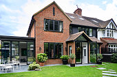
    1) Having a Black Roof

    If the “fifth wall” on your home’s interior is the ceiling, then the ‘fifth wall” on your home’s exterior is your roof.  Choosing a dark charcoal or black roof can add instant dramatic appeal to your home.  Bonus: with a black roof you can have more versatility in choosing your main colour scheme.


    White Home Exterior with Black Roof

    2) Using Black For Visual Direction

    Certain homes can look spectacular completely painted in black, but… 

    All Black Modern Home Exterior

    It's important to consider using black wisely with a balanced and harmonious structure.  Black can be used to create visual pathways that guide the viewer’s eye through the composition. For example, black lines or shapes can lead the viewer from one element to another. Black elements repeated at regular intervals can create a steady, predictable rhythm.


    Brick House Exterior with Black Siding

    3) Painting The Front Door Black

    It’s simple and classic and the perfect backdrop to highlight beautiful hardware. Placing black elements equally on either side of a central axis can provide a sense of stability. This door would be lovely with two black planters on either side to enhance the symmetrical feel.

    Black Painted Door Modern Exterior


     Matisse in 1946 declared; “When I didn’t know what colour to put down, I put down black. Black is a force: I used black as  ballast to simplify the construction.” 


    Using Black for Your Home's Exterior 

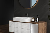
    4) Your Powder Room or Bathroom

    Give your powder room a showstopper look. Using black and white can help to simplify the overall design and focus on the mystique you are trying to convey. Look how the contrast between the two colours can be used to create a dramatic effect to highlight certain aspects of the design. Pairing black with wood and white offers an appealing contrast. 

    Black Bathroom Vanity Wall


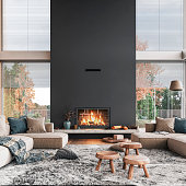
    5) Painting Your Fireplace Black

    Consider using black on your fireplace.  It quickly becomes the focal point of the room and adds volume to the space.  Pairing with natural textures and soft muted tones captures a feeling of comfort and relaxation.


    Modern Black Fireplace Living Room Interior


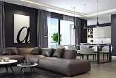
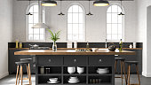
    6) Black Elements in Open-Concept Rooms and Kitchen

    In your open-concept room, varying the size and placement of black elements can create a more dynamic, flowing rhythm that guides the viewer’s gaze less predictably.


    Home Interior Black Wall Wooden Panels


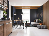
    Black offers strong contrast when paired with lighter colours, especially white. This contrast can make elements stand out and draw attention. 

    Black Accents White Kitchen Space


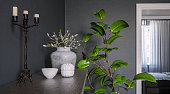
    7) Incorporate Greenery With Black Walls

    Plants can soften the boldness of black and add a touch of nature to the space. 

    Black Walls with Greenery Accents


    These are some of our favourite black paint colours

    EX024 Ebony - our deepest black 

    0515 Silent Sea - from the depths of the mysterious ocean 

    0529 Black Licorice - a quieter black, a bit less punch 

    0536 Subway - our softest black that wraps around you like cashmere 

    Want to get started? Here are quick steps to paint a black wall

    1. Prepare the Room

    Remove Furniture: Clear the room of as much furniture as possible. Cover any remaining furniture and the floor with drop cloths.

    Clean the Wall: Wipe down the wall to remove dust and dirt. Use a mild detergent if necessary, then allow it to dry completely.

    2. Protect Surfaces

    Tape Off Areas: Use painter’s tape to protect trim, ceiling edges, and any areas you don’t want to be painted. Make sure the tape is applied smoothly to prevent paint from seeping underneath.

    3. Prepare the Wall

    Fill Holes and Cracks: Use spackle or putty to fill any holes or cracks in the wall. Let it dry, then sand smooth.

    Sand the Wall: Lightly sand the entire wall to create a smooth surface for the paint to adhere to. Wipe down with a clean cloth to remove dust.

    4. Prime the Wall

    Tinted Primer: Use a gray-tinted primer to help the black paint cover better. Apply the primer evenly with a roller, using a brush for edges and corners. Let it dry completely.

    5. Paint the Wall

    First Coat: Pour the black paint into the paint tray. Use a roller to apply the paint in large, even strokes, working in small sections at a time. Use a brush for the edges and corners. Allow the first coat to dry completely.

    Second Coat: Apply a second coat of black paint to ensure even coverage and a rich, deep colour. Let it dry thoroughly.

    Additional Coats: Depending on the quality of the paint and the desired depth of colour, you might need a third coat. Ensure each coat is completely dry before applying the next.

    6. Remove Tape and Clean Up

    Remove Painter’s Tape: Carefully remove the painter’s tape before the final coat dries completely to avoid peeling off any paint.

    Touch-Up: Use a small brush to touch up any areas where the paint might have bled under the tape or if there are any imperfections.

    Clean Tools: Clean your brushes, rollers, and paint tray immediately after use to keep them in good condition.

    7. Final Touches

    Inspect the Wall: After the paint is fully dry, inspect the wall for any missed spots or uneven areas and touch them up as needed.

    Rearrange Furniture: Once the paint is completely dry and cured (usually a few days), move your furniture back into place and enjoy your new black wall!


    Tips for Success

    Quality Paint: Invest in high-quality paint for better coverage and durability.

    Proper Ventilation: Ensure the room is well-ventilated while painting to help the paint dry faster and reduce fumes.

    Test Area: If unsure about the shade of black, paint a small test area first to see how it looks in different lighting.

    Painting a black wall can dramatically change the ambiance of a room, making it feel modern and chic. By following these steps, you’ll achieve a professional-looking finish that enhances your space.


    Are you ready to get started? Visit your nearest Cloverdale Paint store now and speak with any of our Customer Service Representatives.