Neutral colours are the hardest colours to choose!
The trend towards using neutral colours in home decor has gained significant popularity in recent years. Several factors contribute to this shift, including psychological, practical, and aesthetic considerations. Here are some reasons why many people prefer neutrals over more vibrant colours:
Why do we love neutrals?
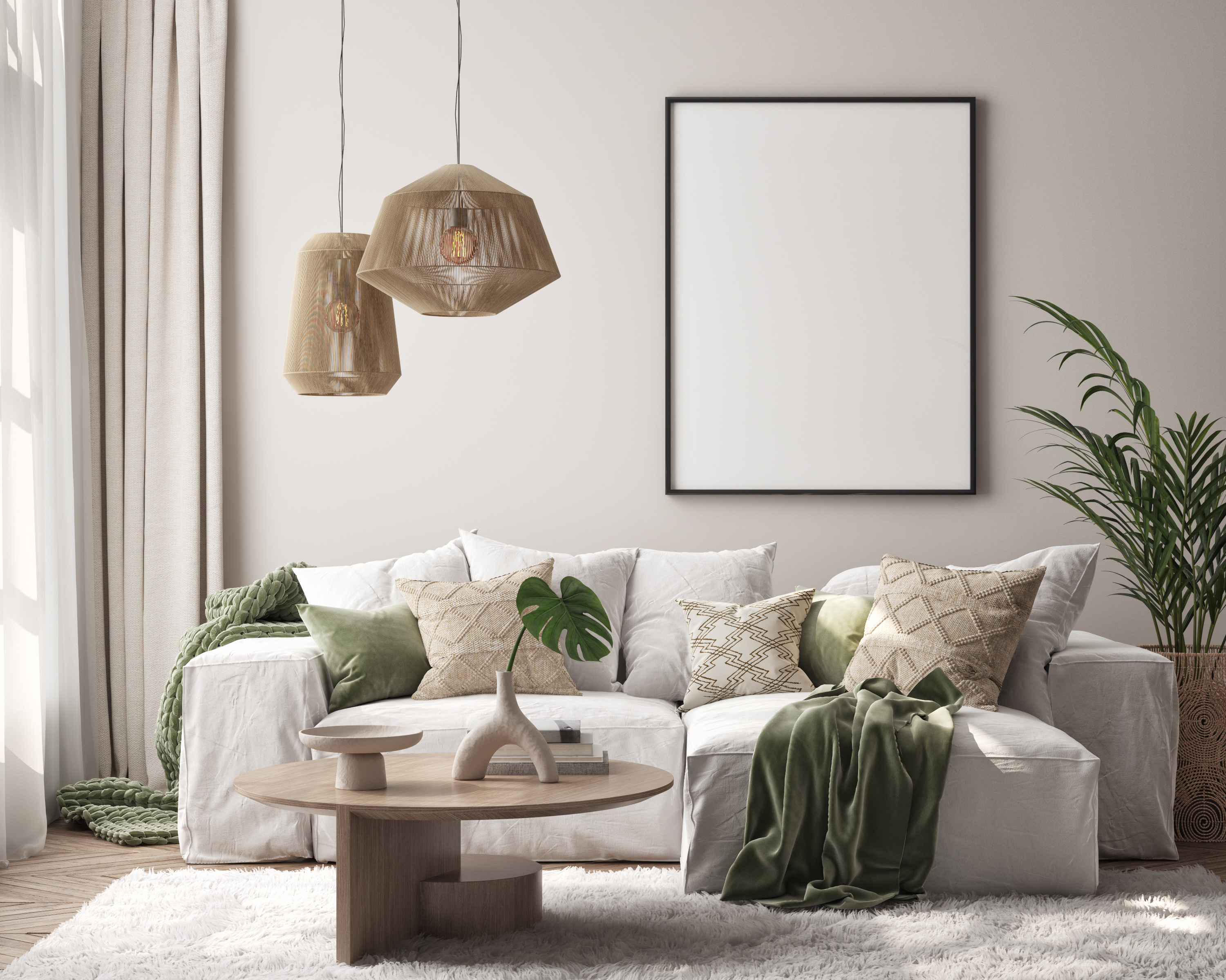
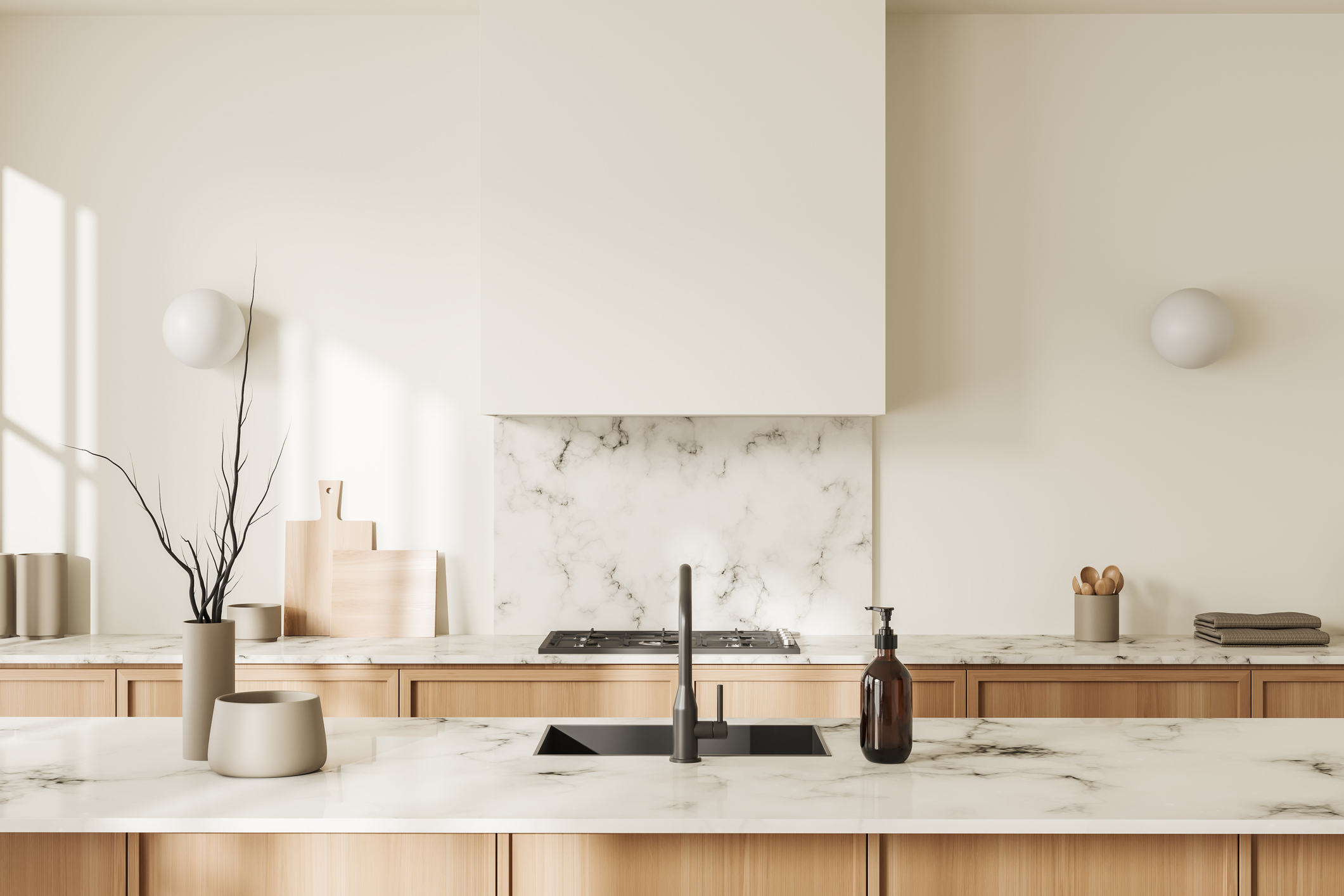
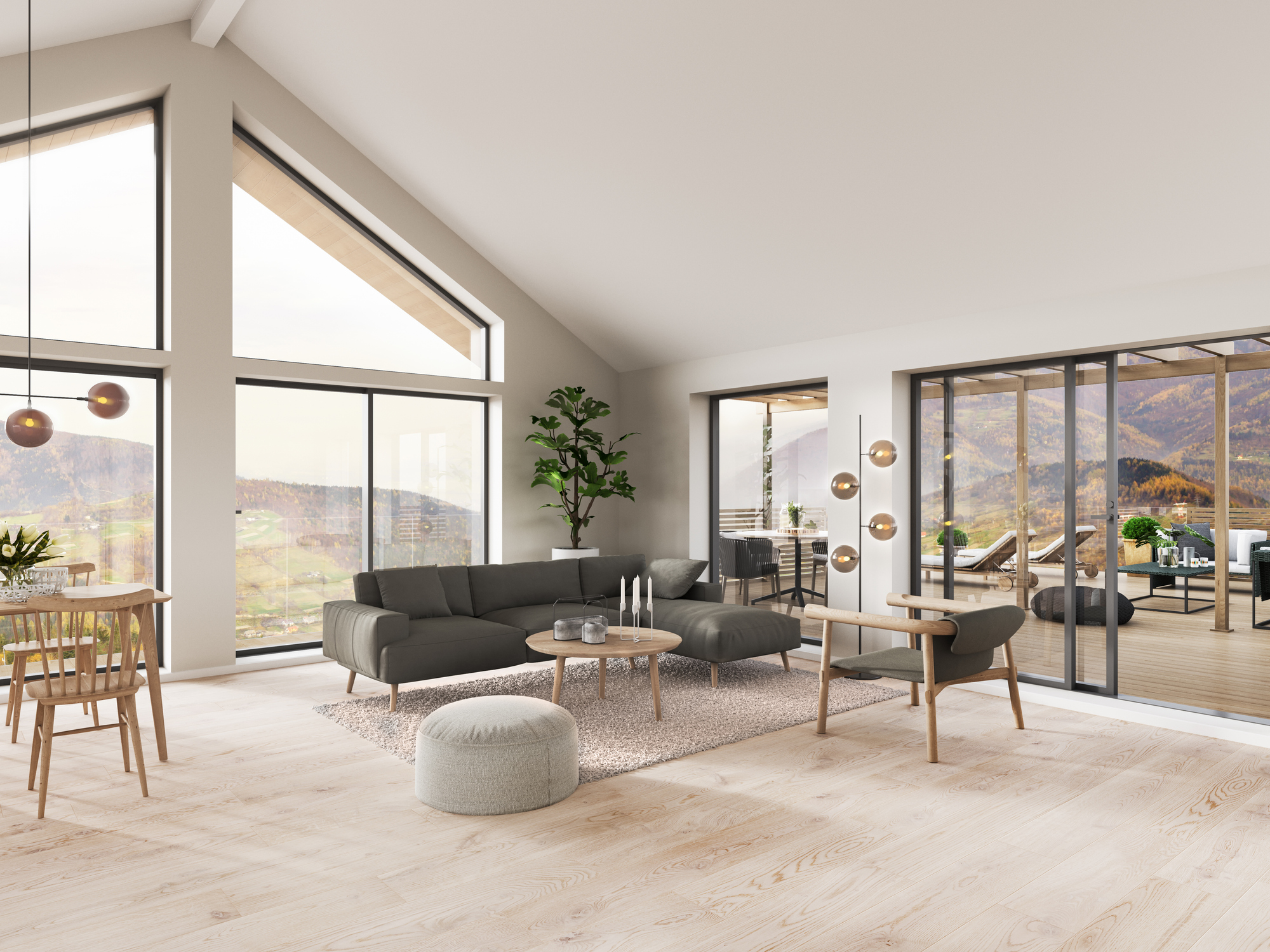
Neutrals like beige, grey, white, and taupe are versatile and can easily blend with different decor styles, making them a timeless choice. People tend to choose neutrals because they don't go out of style quickly, reducing the need for frequent redecorating.
Neutral colours provide a cohesive backdrop that can accommodate various colours in furniture, accessories, and artwork. This makes it easier to change out other decor elements without clashing. Neutrals allow for greater flexibility in adding accent colours through pillows, rugs, and other decor items, making it easy to update the look of a room without repainting.
Light neutrals can make a room appear larger and more open, which is especially desirable in smaller spaces or urban living environments, especially in open-concept floor plans. Neutral colours are often perceived as calming and serene, contributing to a peaceful and relaxing home environment.
Neutral colours are generally more appealing to a wider audience. Homes decorated in neutral tones are often easier to sell because potential buyers can more easily envision their belongings in the space. Realtors often advise homeowners to use neutral colours when preparing a home for sale, as it creates a blank canvas that can attract more buyers.
The minimalist design trend emphasizes simplicity and clutter-free spaces, often utilizing neutral colour palettes to achieve a clean and orderly look. Many contemporary and modern design styles favour neutral colours for their sleek and sophisticated appearance.
Neutral colours are less stimulating and can create a soothing environment that helps reduce stress and anxiety. People often view neutrals as a safe choice, avoiding the risk of bold colours that they might tire of quickly or that might not match their evolving tastes.
Popular design shows, social media influencers, and home decor magazines often feature neutral colour schemes, setting trends that many people follow. Seeing beautifully designed neutral interiors on platforms like Instagram and Pinterest can inspire people to recreate similar looks in their own homes.
Neutrals, especially lighter shades, can show less wear and tear over time compared to darker or more vibrant colours that may fade or show scratches more easily. Neutral walls make it easier to layer textures and patterns in furniture and accessories, adding depth and interest to a room without overwhelming it with colour.
Why are neutral colours hard to choose from?
Neutral paint colours are often difficult to choose for several reasons.
Neutral colours have subtle differences that can be hard to distinguish on a paint chip but become more noticeable on a larger surface.
The appearance of neutral colours can change significantly under different lighting conditions (natural light, artificial light, etc.), making it hard to predict how the colour will look in a room.
Many neutral colours have undertones (hints of other colours like blue, green, pink, or yellow) that can influence how the colour looks once applied. These undertones can be difficult to detect initially but can become prominent once the paint is on the wall.
Neutral colours are influenced by the colours of furniture, flooring, and other elements in the room. A neutral colour that looks great in one setting might not look as good in another due to the surrounding colours.
Everyone's perception of colour is slightly different, and what one person sees as a perfect neutral might appear too warm or cool to someone else.
Paint chips and small sample areas don’t always provide a true representation of the colour. Testing large swatches or using sample pots to paint bigger areas can help.
How do I choose the right neutral colour for my home?
Choosing a good neutral paint colour can be a bit challenging, but with a few careful steps, you can find the perfect colour for your space. Here's a guide to help you:
Different rooms serve different purposes, so think about how you want the space to feel. For example, a living room might benefit from a warm, cozy neutral, while a bedroom might be better suited to a calm, cool tone. Decide whether you want the room to feel warm and inviting, cool and serene, or neutral and balanced.
Observe how much natural light the room gets. Rooms with plenty of natural light can handle cooler neutrals, while darker rooms may benefit from warmer tones. Consider the type of artificial lighting used in the room (incandescent, LED, fluorescent) as it can affect the colour's appearance.
Take into account the colours of your furniture, flooring, cabinetry, and other fixtures. Ensure the neutral colour complements these elements. Think about the accent colours in the room and choose a neutral that will harmonize with them.
Determine whether you prefer neutrals with warm undertones (yellows, reds) or cool undertones (blues, greens). Warm neutrals create a cozy atmosphere, while cool neutrals offer a more serene, airy feel.
Get paint swatches and view them at different times of the day to see how they look under varying lighting conditions. Purchase small sample pots and paint larger areas on your walls to get a better idea of how the colour will look once it's applied.
Place your samples next to your existing decor to see how the colour interacts with the room's elements. If possible, test the colour in different parts of the room to see how it looks in various lighting conditions and against different backgrounds.
Tips and tricks to pick a neutral colour for your home
Cast your net really wide at the paint store. Don’t just consider 3-4 sample chips based on what you perceive will work in your space. Select some from slightly out of your ideal range. You’ll be glad you did as you may be surprised at the results when you bring them home for review.
Bring some of your favourite items with you to the store that illustrate colours you would love in your space. A small pottery bowl, a pillow, silk florals, a small framed print… This can help direct you to to the correct colours on the paint chip wall at the store without relying on solely your memory of the colours you like.
Once home in your space, lay out all the chips you have selected. You will naturally gravitate to a few. Mark these immediately and omit all the others. Trust your instinct!
It’s an interesting phenomenon that often, the paint colour looks darker once applied to an interior wall than it did on the chip. Don’t just splash and dab your test patch areas, make them big so you can really see what is happening. If you don’t want to commit to sampling on your walls quite yet, consider painting a large board that you can move around the room. Are your walls textured? This can also affect the finished colour and look darker than the paint chip.
A final note on selecting neutral colours...
While neutrals offer many benefits, it's also worth noting that personal preference plays a significant role. Some individuals love the bold statement that vibrant colours can make and choose to incorporate them in various ways. The key is to find a balance that reflects one's personality and creates a comfortable and aesthetically pleasing living environment.
Considering these factors, it’s important to take your time, view paint samples under different lighting conditions, and consider the room's overall design and furnishings when selecting a neutral paint colour.
By taking these steps, you can narrow down your options and choose a neutral paint colour that will enhance your space and create the desired atmosphere you’ve been anticipating.
Our most popular neutral colours
Warm Tones:
 |
 |
 |
| EX325 Seductive Grey |
EX326 Greige |
EX327 Twine |
Cool Tones:
 |
 |
 |
| EX337 Morning Fog |
EX314 Sateen |
EX319 Cloud Cover |
 |
 |
 |
| EX344 Moon |
EX333 Downtown |
EX318 Smoky Quartz |
Colours will look different from digital screens. Please visit your nearest Cloverdale Paint store today and pick up a sample colour card to test based on ideal lighting conditions.