Well hello there! What’s your sign?
Have you ever wondered if you have a pre-determined love for certain colours based on your zodiac sign?
Astrological signs are often associated with certain colours that are believed to reflect their traits, energies, and preferences. Here’s a look at the colours commonly linked to each zodiac sign and the reasons why.
Aries (Mar 21-April 19) - Dynamic Personality
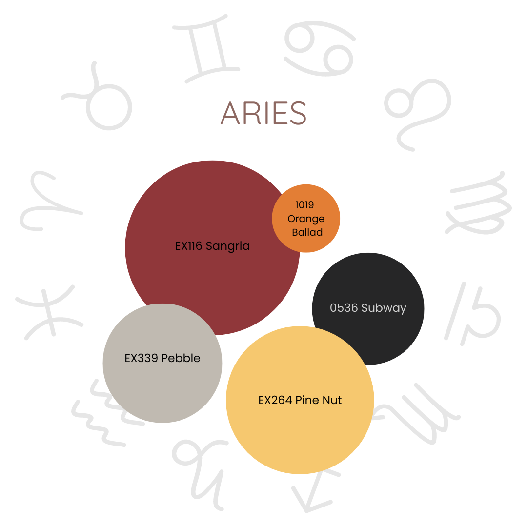
Main Colour: Red
Secondary Colours: Orange, yellow, black and greige.
Reason: Red symbolizes energy, passion, and action, which align with Aries' dynamic and adventurous nature.
The Aries colour palette is a passionate symphony of hues, each one carefully chosen to mirror the fiery essence of this dynamic sign. At the heart of this palette is red, a colour that pulses with the rhythm of Aries' vibrant energy, fierce passion, and unyielding drive. It captures the very lifeblood of Aries, embodying their fiery spirit and insatiable zest for life.
Orange wraps around this fiery core like a warm, golden embrace, kindling enthusiasm and sparking creativity, a perfect reflection of Aries' adventurous heart. Yellow, like the first light of dawn, illuminates their bright mind and optimistic soul, enhancing their natural clarity and wisdom.
Greige offers a soft, gentle contrast, harmonizing beautifully with Aries' pioneering spirit. Finally, black, like the velvet night framing the stars, adds an air of sophistication and mystery, emphasizing Aries' powerful and assertive presence.
Together, these colours weave a romantic and captivating portrait of Aries, a sign that lives boldly, loves deeply, and embodies the very essence of passion and adventure.
Taurus (Apr 20-May 20) - Grounded Personality
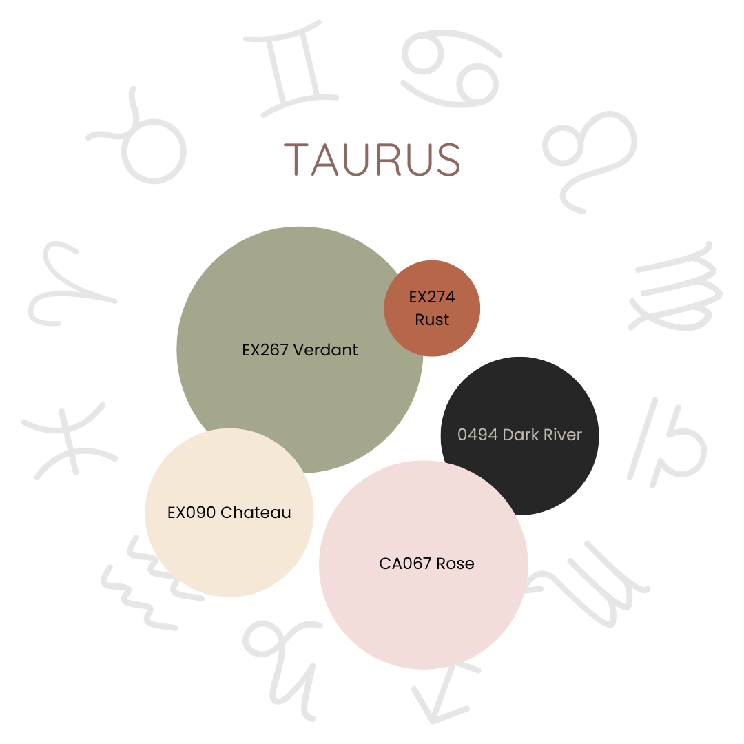
Colour: Green
Secondary Colours: Pink, neutral cream, forest green, gold and terracotta.
Reason: Green represents growth, stability, and nature, resonating with Taurus' earthy, grounded, and nurturing qualities.
The Taurus colour palette is a tender embrace of nature's most soothing hues, each one chosen to echo the grounded and nurturing spirit of this sign. At the heart of this palette is green, a colour that whispers of growth, stability, and a deep, abiding connection to the earth, mirroring Taurus' love for nature and their steady, dependable soul.
Pink and cream, with their soft, delicate tones, add a layer of gentle elegance, like the blush of a rose or the warmth of morning light. Cream provides a neutral canvas, enhancing the warmth and sophistication that Taurus naturally exudes.
Forest green deepen this connection to nature, bringing a rich, calming energy that resonates with Taurus' love for the earth's embrace. Finally, terracotta, warm and earthy, grounds the palette, echoing Taurus' practical, nurturing, and deeply rooted nature.
Together, these colours weave a romantic and serene tapestry, reflecting the stable, luxurious, and earthy essence of Taurus, a sign that finds beauty in the simple pleasures of life and remains ever-steadfast in its love and devotion.
Gemini (May 21-Jun 20) - Playful Personality
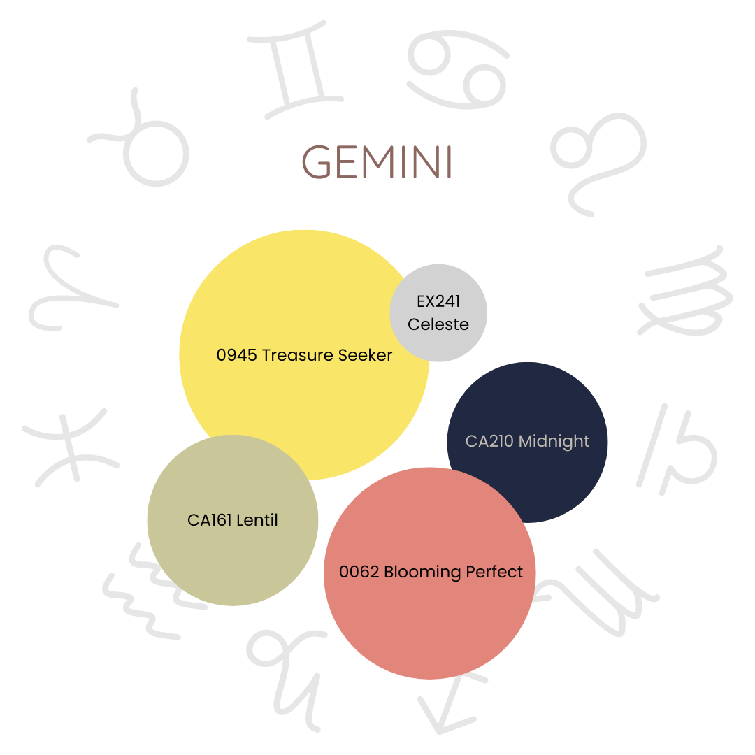
Colour: Yellow
Secondary Colours: Green, coral, silver-grey and navy.
Reason: Yellow is a vibrant, light, and versatile colour that reflects its lively, communicative, and adaptable nature.
The Gemini colour palette is a delightful dance of hues, each one chosen to capture the lively and playful essence of this curious sign. At the center of this palette is yellow, a colour that shines like the morning sun, embodying Gemini's bright intellect and adaptable spirit. It's a hue that flirts with both lightness and depth, perfectly mirroring Gemini's dual nature—charming and profound.
Green weaves into the palette like the first blush of spring, symbolizing growth, balance, and renewal. Coral adds a playful splash of warmth and creativity, like the rosy glow of a sunset, reflecting Gemini's imaginative and spontaneous side. Silver grey, with its cool elegance, whispers of modernity and sophistication, captures a Gemini's love for all things new and exciting. Navy, deep and mysterious, grounds the palette, offering a contrast that speaks to Gemini's hidden depths of wisdom and reliability.
This palette is as versatile and enchanting as Gemini itself, bringing a lively yet balanced energy to any space.
Cancer (Jun 21-July 22) - Nurturing Personality
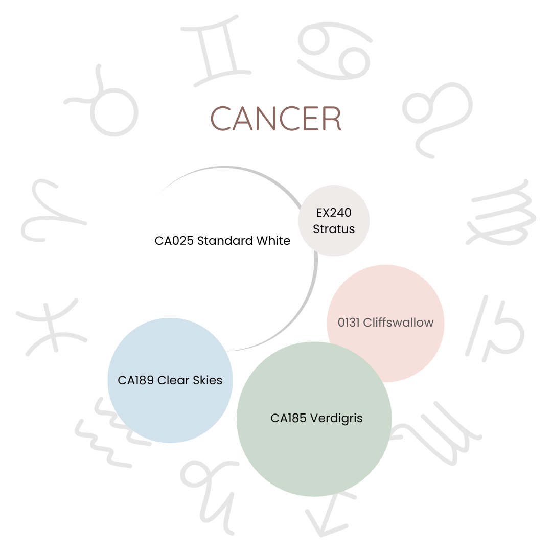
Colour: White
Secondary Colours: Silver, sea green, pale blue, soft pink
Reason: Calming and soothing colours reflect their sensitive, intuitive, and home-loving nature
The Cancer colour palette is a tender caress of hues, each one carefully chosen to reflect the nurturing, intuitive soul of this gentle sign. At its core is white, a colour that glows with purity and serenity, embodying Cancer's love for simplicity and the quiet peace of home.
Silver drifts through the palette like moonlight on water, representing Cancer's deep intuition and reflective nature. Its soft nuance is a reminder of the calm and quiet wisdom that Cancer brings to every space they touch. Sea green and pale blue, like the gentle waves of a tranquil sea, evoke Cancer's deep connection to water, their soothing presence flowing effortlessly into every corner of the home. Soft pink, delicate and romantic, whispers of Cancer's gentle heart, its tender accents speaking to their deep compassion and warmth.
Leo (July 23-Aug 22) - Charismatic Personality
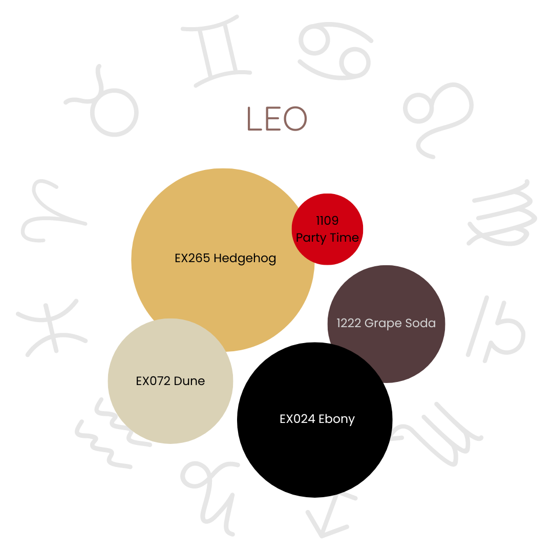
Colour: Gold
Secondary Colours: Red, purple, black and tan
Reason: Vibrant, warm, and luxurious colours that reflect their bold, charismatic, and confident nature.
The Leo colour palette is a dazzling dance of hues, each one chosen to capture the radiant and charismatic essence of this bold sign. At its heart is gold, glowing with opulence, confidence, and warmth, like the sun’s golden embrace, perfectly embodying Leo’s majestic and magnetic presence.
Red, rich and intense, weaves through the design with the vigour of a roaring flame, symbolizing Leo’s passionate heart and powerful spirit.
Purple, deep and luxurious, adds a regal touch, like velvet drapes in a royal chamber, conveying wisdom, ambition, and the grand elegance that Leo naturally commands. Black, with its mysterious allure, anchors the palette, offering an elegant contrast that enhances Leo’s commanding presence, while tan serves as a smooth canvas, balancing the vibrancy of the other colours.
Together, these hues create a romantic and sumptuous sanctuary, a space that exudes the warmth, confidence, and charismatic charm of Leo.
Virgo (Aug 23 - Sept 22) - Practical Personality
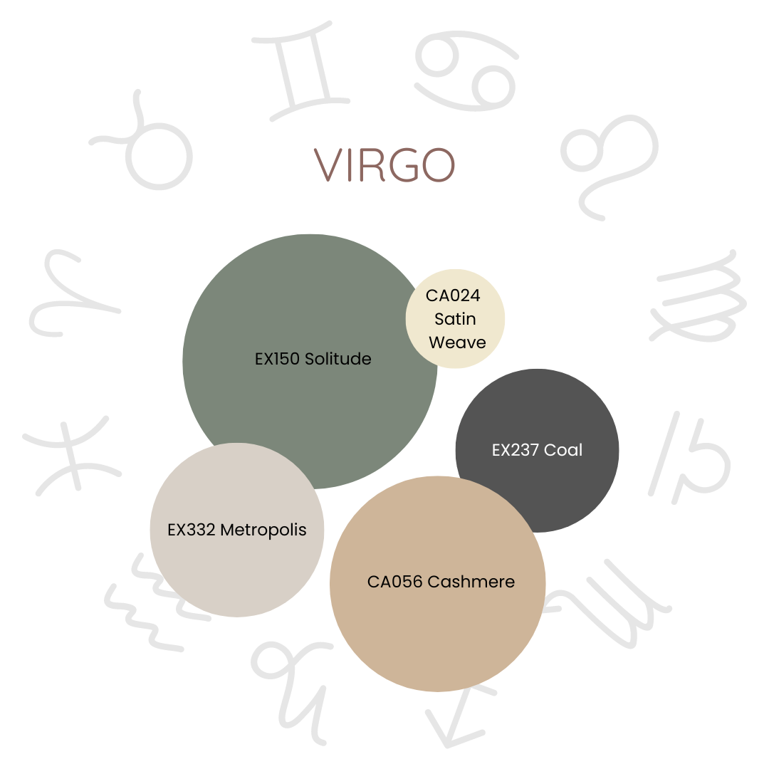
Colour: Earthy Green
Secondary Colours: Soft brown, cream, taupe, and charcoal
Reason: Focus on earthy, muted, and calming colours that reflect their practical, meticulous, and harmonious nature
The Virgo colour palette is a soothing serenade of muted hues, each carefully chosen to reflect the practical, meticulous, and harmonious nature of this grounded sign. Earthy green, the heart of the palette, embodies the serene strength of nature, symbolizing growth, stability, and a gentle balance that mirrors Virgo’s steadfast character.
Soft brown weaves through this design like the comforting embrace of a well-loved blanket, representing reliability and warmth. This hue creates a foundation of enduring stability, evoking a cozy, inviting atmosphere that reflects Virgo’s nurturing and practical spirit.
Cream and taupe flow gracefully across larger surfaces, like the gentle touch of a morning mist, adding a sense of calm and understated elegance. These neutral tones offer a tranquil backdrop, enhancing the serene ambiance of the space and providing a perfect canvas for richer accents.
Charcoal, deep and refined, offers a striking contrast, adding depth and sophistication to the design. It reflects Virgo’s analytical mind and nuanced understanding, grounding the palette with a touch of elegance.
Together, these colours create a romantic and tranquil sanctuary, a space that resonates with the essence of Virgo.
Libra (Sept 23 - Oct 22) - Diplomatic Personality
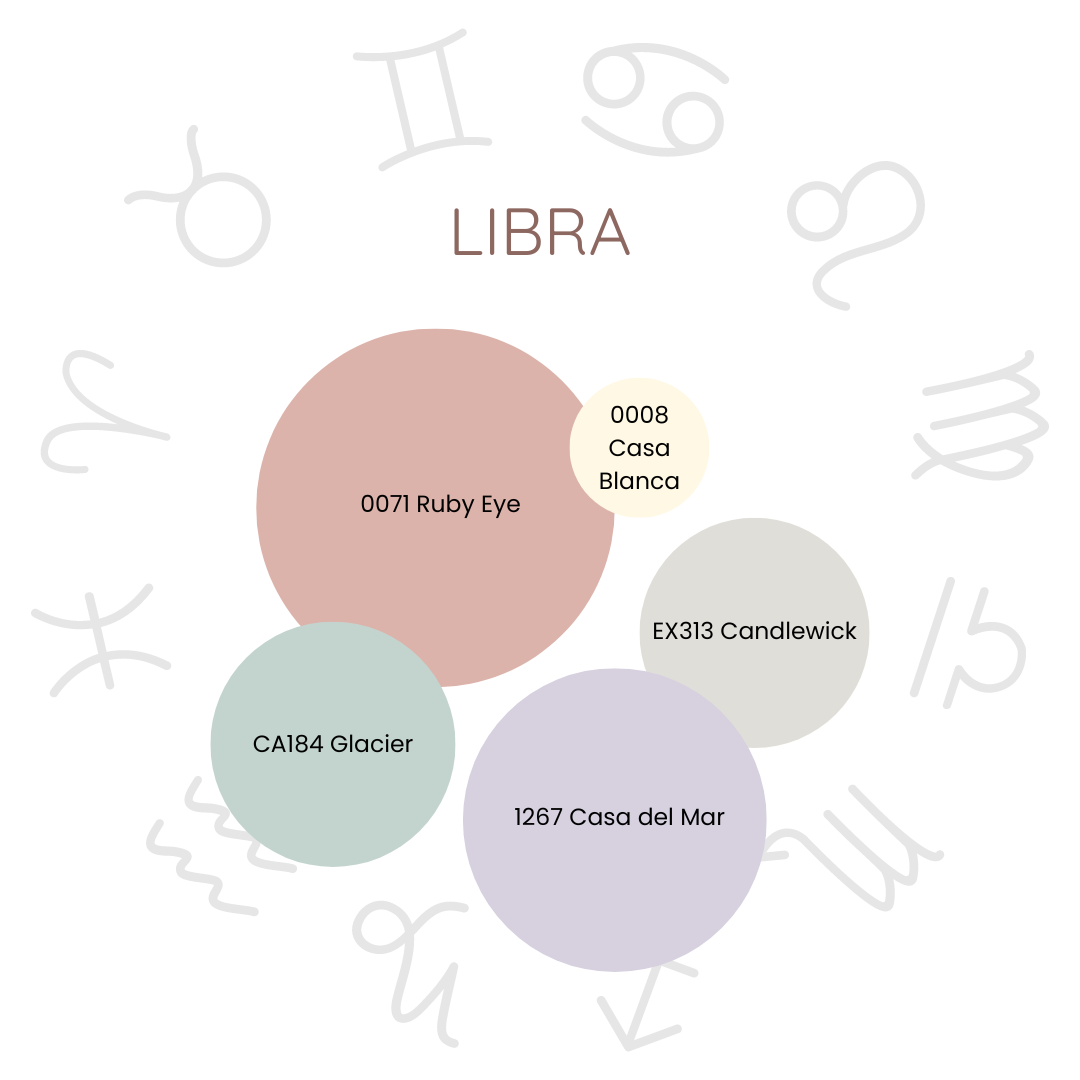
Colour: Soft Pink
Secondary Colours: Light turquoise, cream, light gray and lavender
Reason: Harmonious, elegant, and balanced colours that reflect their aesthetic, sociable, and diplomatic nature.
The Libra colour palette is an exquisite harmony of hues, each one chosen to reflect the aesthetic, sociable, and diplomatic nature of this sign. Soft pink and light turquoise are at the heart of this design, symbolizing love, beauty, and calm, perfectly capturing Libra's gentle and artful spirit.
Soft pink, as the dominant colour, bathes the space in a glow of warmth and affection, embodying Libra’s love for beauty and their nurturing heart. Light turquoise, used as a secondary dominant colour or in large accents, brings a sense of calm and tranquillity, mirroring Libra's ability to create peace and harmony wherever they go.
Cream and light gray serve as the secondary colours, adding layers of purity, simplicity, and elegance. These hues provide a neutral and elegant backdrop that enhances the overall serenity of the space, reflecting Libra’s refined taste and love for understated sophistication.
Lavender, used sparingly as an accent, introduces a touch of grace and luxury. Its subtle presence brings a sense of tranquillity and luxury, enhancing the aesthetic charm and balanced harmony of the palette.
Together, these colours create a space that is both elegant and inviting, embodying the essence of Libra. This palette not only reflects Libra’s diplomatic and sociable nature but also creates an environment that is perfectly attuned to their love for beauty and balance.
Scorpio (Oct 23-Nov 21) - Passionate Personality
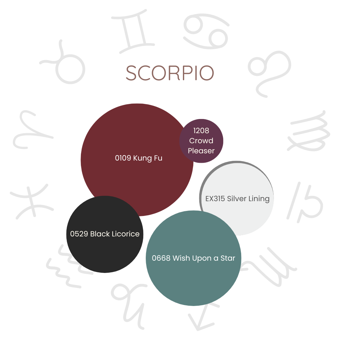
Colour: Deep Red
Secondary Colours: Black, purple, teal, and silver gray.
Reason: deep, intense, and mysterious colours that reflect their passionate, transformative, and magnetic nature.
The Scorpio colour palette is a rich and intoxicating array of hues, each woven together to capture the enigmatic and deeply passionate essence of this sign. Deep red, the heart of this palette, courses with an intensity that is both alluring and profound, perfectly embodying Scorpio's boundless passion and transformative power.
Black, as a secondary dominant colour, cloaks the design in mystery and elegance, like the velvety night sky, deepening the sense of intrigue and sophistication that defines Scorpio's mysterious allure. Dark purple adds a luxurious contrast, its rich depths resonating with Scorpio’s love for the profound and complex, echoing the enigma of a twilight shadow.
Teal, as an accent, injects a splash of vibrancy, like a hidden oasis in a dark forest, reflecting Scorpio's dynamic and sometimes unpredictable energy. Silver gray, sleek and sophisticated, anchors the palette with a modern edge, mirroring Scorpio’s avant-garde and refined tastes.
Together, these colours craft a space that is as intensely captivating as Scorpio itself.
Sagittarius (Nov 22-Dec 21) - Optimistic Personality
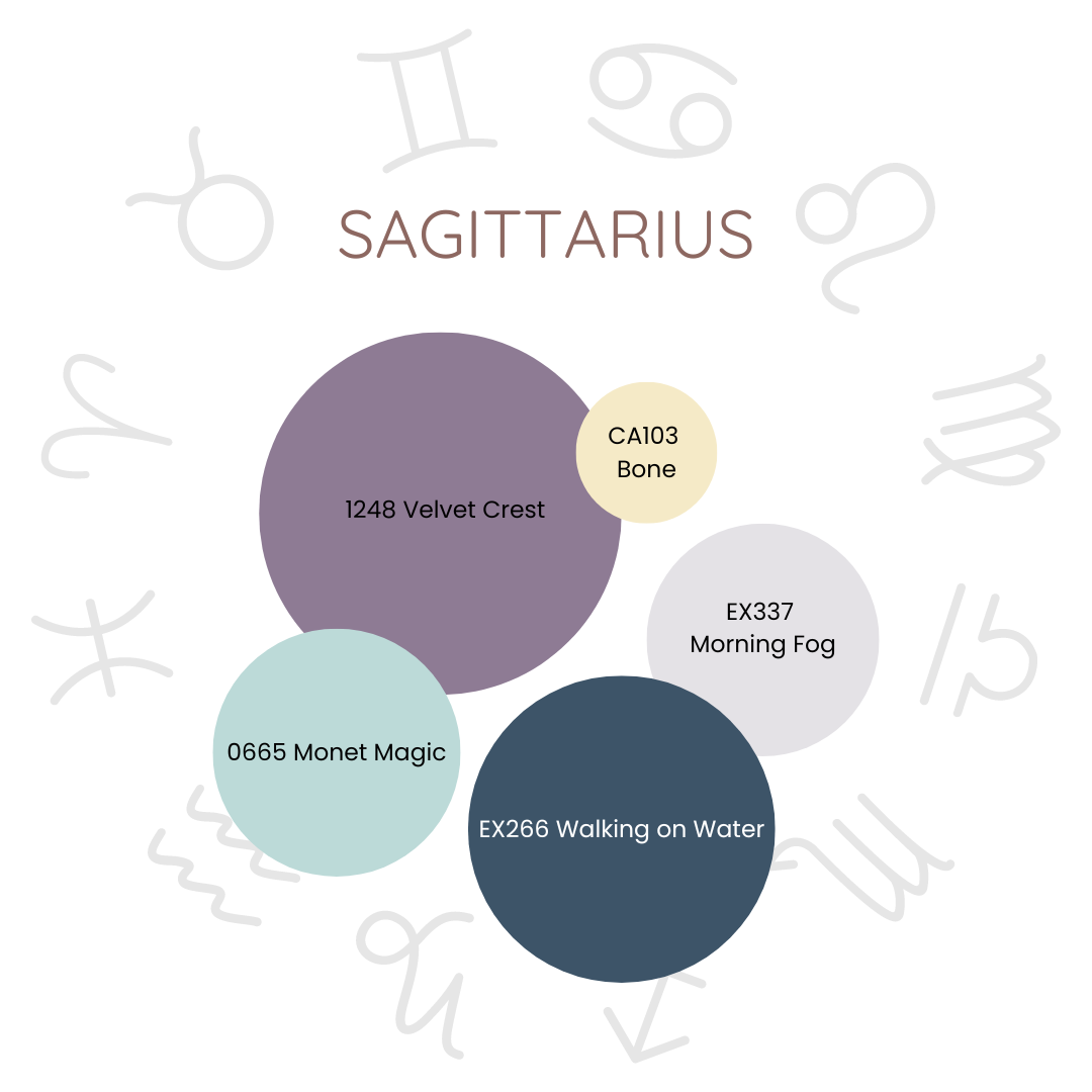
Colour: Purple
Secondary Colours: Royal blue. Turquoise, palest yellow
Reason: Vibrant, adventurous, and optimistic colours that reflect their free-spirited, enthusiastic, and philosophical nature.
The Sagittarius colour palette is an enchanting tapestry of vibrant hues, each woven with care to reflect the free-spirited, enthusiastic, and philosophical nature of this sign. At the heart of this design is purple, a majestic colour that resonates with the wisdom and creativity of Sagittarius, embodying their visionary spirit and expansive dreams.
Royal blue, as deep as the ocean and as vast as the sky, envelops the palette in confidence and exploration, symbolizing Sagittarius's endless quest for knowledge and their thirst for adventure. It whispers of distant horizons and uncharted territories, inviting endless possibilities and discoveries.
Turquoise and palest yellow serve as secondary colours, brightening the palette with their vivid contrast. Turquoise, like a clear sky on a sunny day, brings clarity and balance, while pale yellow, soft and uplifting, celebrates Sagittarius's sunny optimism and zest for life.
Together, these hues craft a space that is not just vibrant and adventurous but also romantically inviting—a perfect sanctuary for Sagittarius's passionate, philosophical soul. It's a palette that inspires wanderlust and dreams, inviting anyone who enters to dream big and explore the boundless joy and wisdom that life has to offer.
Capricorn (Dec 22-Jan 19) - Ambitious Personality
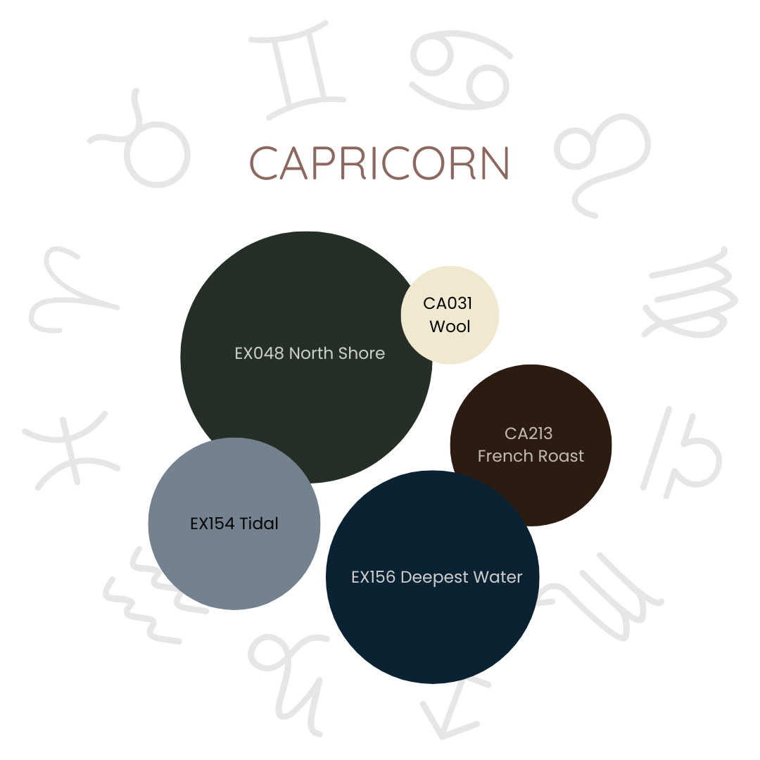
Colour: Dark Green
Secondary Colours: Deep brown, slate gray. Cream, navy blue,
Reason: Sophisticated, earthy, and understated colours that reflect their practical, disciplined, and ambitious nature.
The Capricorn colour palette is an elegant symphony of earthy hues, each one thoughtfully chosen to echo the practical, disciplined, and ambitious nature of this sign. At the heart of this palette, dark green and deep brown weave a tapestry of growth, stability, and steadfast ambition, reflecting Capricorn’s enduring and grounded spirit.
Dark green, rich and lush as an ancient forest, speaks to the soul of Capricorn, embodying their resilience and capacity for renewal. It resonates with their deep-rooted sense of purpose and their unyielding pursuit of their goals. Deep brown adds a layer of warmth and earthiness, like the fertile soil that nurtures the seeds of their aspirations, reinforcing Capricorn's pragmatic and reliable nature.
Slate grey and cream serve as the secondary colours, providing a sophisticated backdrop that contrasts beautifully with the earthier tones. Slate gray, cool and refined, offers a sleek professionalism, while cream, soft and subtle, whispers of purity and elegance, enhancing the refined and understated beauty of the palette.
Navy blue, used as a striking accent, deepens the narrative, adding a touch of sophisticated depth that highlights Capricorn’s strategic and ambitious personality.
Together, these colours create not just a space but a sanctuary that embodies Capricorn’s essence—a blend of sophistication, practicality, and understated elegance. Whether in a cozy corner of a living room, a serene bedroom, or a dignified office, this palette crafts a harmoniously elegant environment that resonates with Capricorn’s spirit of ambition and disciplined pursuit of excellence—a truly romantic reflection of their profound and earnest nature.
Aquarius (Jan 20-Feb 18) - Independent Personality
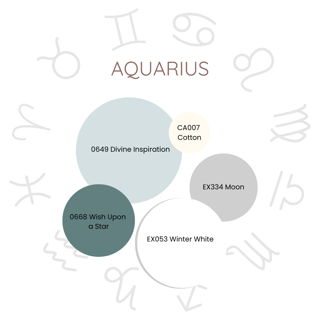
Colour: Aqua
Secondary Colours: Silver, white, turquoise, cream
Reason: Innovative, refreshing, and unconventional colours that reflect their progressive, independent, and visionary nature.
The Aquarius colour palette is a mesmerizing constellation of hues, each thoughtfully chosen to mirror the progressive, independent, and visionary spirit of this sign. Aqua, the centrepiece of this palette, shimmers with innovation and originality, its tranquil and refreshing tones embodying Aquarius's clarity and open-mindedness.
Aqua, like a gentle wave washing over the senses, brings a sense of tranquillity and freshness that resonates deeply with Aquarius's forward-thinking and innovative spirit. Silver and white serve as the secondary colours, providing a sleek, modern contrast. Silver, reflective and futuristic, captures the luminescence of moonlight, resonating with Aquarius's futuristic outlook and visionary dreams. White adds a layer of purity and simplicity, enhancing the ethereal quality of the palette.
Turquoise weaves through the design with vibrancy and creativity and deepens the palette with its rich, invigorating tones, evoking the depth of the ocean.
Together, these colours craft not just a space but a sanctuary that celebrates the essence of Aquarius—innovation, vibrancy, and a futuristic charm. Whether in a serene living room, a tranquil bedroom, or an inspiring office, this palette creates an environment that beckons Aquarius's visionary spirit, inviting them to dream, innovate, and embrace their independence in a setting as romantic and boundless as their imagination.
Pisces (Feb 19-Mar 21) - Compassionate Personality
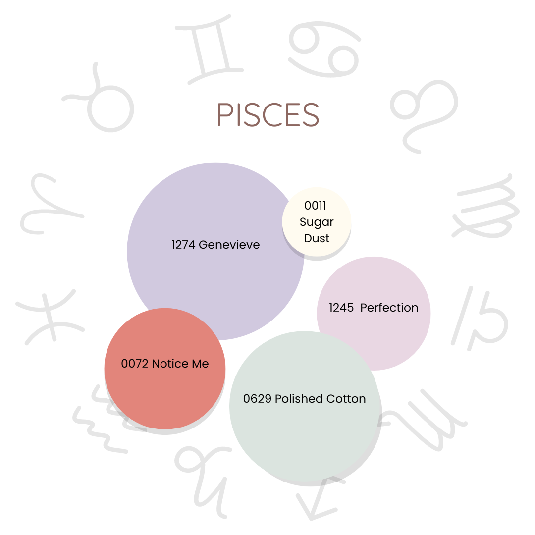
Colour: Lavender
Secondary Colours: Seafoam green, coral, creamy pearl and soft pink
Reason: Soothing, dreamy, and ethereal colours that reflect their compassionate, intuitive, and imaginative nature.
The Pisces colour palette is a dreamy and ethereal cascade of hues, each tenderly selected to mirror the compassionate, intuitive, and imaginative essence of this sign. Seafoam green and lavender, are the main colours of this palette, a whisper of tranquillity, healing, and renewal, like a serene lagoon reflecting the soft hues of twilight.
Seafoam green washes over the space with the soothing embrace of ocean waves, evoking a sense of deep tranquillity and spiritual renewal. This colour captures the serene depths of the sea, inviting calm and reflection. Lavender drapes the palette in layers of imagination and spirituality, reflecting the mystical and peaceful soul of Pisces.
Coral injects a warm, creative spark, embodying Pisces' passion and their endless well of creativity. Pearl white adds a touch of purity and understated elegance, while soft pink in delicate accents further softens the design, enhancing its gentle, dreamlike quality.
Together, these colours weave a romantic and soothing sanctuary, a space that captures the essence of Pisces—serene, imaginative, and ethereally enchanting. Designed for living rooms, bedrooms, or offices, this palette creates an environment where the dreamy and compassionate Pisces soul can flourish, surrounded by beauty that inspires and nurtures their deep, boundless imagination.
Do you agree with your colours? Send this to a friend or family member and see if they agree! Now, you can get a set of colours based on your astrological sign and paint your home that suit your personality.